

10 Usability Heuristics for User Interface Design: The Complete Guide
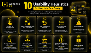
Creating an intuitive digital product goes beyond making it visually attractive. Every successful website, mobile application, or SaaS platform follows proven usability principles that help users complete tasks quickly and efficiently. One of the most recognized frameworks is the 10 Usability Heuristics for User Interface Design, developed by Jakob Nielsen.
These usability heuristics serve as practical guidelines for designing interfaces that reduce user frustration, improve accessibility, and increase customer satisfaction. Whether you're a beginner learning UI/UX or an experienced designer building enterprise software, understanding the 10 Usability Heuristics for User Interface Design is essential.
At Weekend UX, we teach aspiring designers and professionals how to apply these usability principles in real-world projects. By mastering the 10 Usability Heuristics for User Interface Design, students learn to create interfaces that are intuitive, engaging, and user-centric.
In this guide, you'll explore each heuristic with detailed explanations, practical examples, and implementation tips that help improve usability across websites, mobile applications, dashboards, and enterprise products.
What Are the 10 Usability Heuristics for User Interface Design?
The 10 Usability Heuristics for User Interface Design are usability principles introduced by Jakob Nielsen in 1994. Instead of being strict design rules, they act as general guidelines that help designers identify usability issues before products reach users.
These heuristics are widely used during:
UX Audits
Heuristic Evaluation
Product Design Reviews
Website Redesign
Mobile App Design
SaaS Dashboard Design
User Testing
UX Research
Organizations like Google, Microsoft, Apple, Amazon, and countless startups use these principles to create intuitive digital experiences.
Why Are Usability Heuristics Important?
Following the 10 Usability Heuristics for User Interface Design provides measurable business benefits.
Benefits include:
Higher user satisfaction
Better task completion rate
Lower bounce rate
Reduced support requests
Increased customer retention
Better accessibility
Improved conversion rate
Easier navigation
Higher trust
For designers, heuristics become a checklist before launching any digital product.
At Weekend UX, usability heuristic evaluations are an essential part of our UI/UX curriculum because they prepare students for real-world product design challenges.
1. Visibility of System Status
The first principle of the 10 Usability Heuristics for User Interface Design states that users should always know what is happening inside the system.
The interface should provide immediate feedback after every user action.
Good Examples
Loading spinner
Progress bar
File upload percentage
Success message
Error notification
Payment processing status
Imagine submitting an online payment.
If nothing happens after clicking "Pay Now," users may wonder:
Did my payment go through?
Should I click again?
Is the website frozen?
Instead, showing:
"Processing your payment..."
gives confidence to users.
Best Practices
Show loading indicators
Display progress bars
Confirm completed actions
Notify users of delays
Use animations carefully
Give instant feedback
Real-World Example
Google Drive displays an upload progress bar while files are uploading.
Dropbox shows syncing status in real time.
These interfaces successfully implement the first heuristic of the 10 Usability Heuristics for User Interface Design.
2. System and Real World Compatibility
Users should not have to learn a completely new language to use your product.
Instead, interfaces should use familiar words, icons, and workflows.
This is one of the most important principles of the 10 Usability Heuristics for User Interface Design because it reduces cognitive load.
Good Examples
Instead of writing:
"Execute Transaction"
Use:
"Send Money"
Instead of:
"Terminate Session"
Use:
"Log Out"
Instead of:
"Create New Entity"
Use:
"Create Account"
Everyday Examples
Shopping carts
Trash bins
Folders
Magnifying glass
Calendar icons
Heart icons
All these symbols already exist in the real world, making digital interfaces easier to understand.
Best Practices
Use simple language
Avoid technical jargon
Follow familiar conventions
Use recognizable icons
Organize information naturally
Example
Food delivery apps use restaurant menus that resemble printed menus.
Banking apps organize accounts similarly to physical bank statements.
This familiarity reduces the learning curve.
At Weekend UX, students are encouraged to conduct user research before naming buttons or designing workflows, ensuring interfaces align with users' mental models.
3. User Control and Freedom
People make mistakes.
Good interfaces should always provide a way to recover.
The third principle of the 10 Usability Heuristics for User Interface Design emphasizes giving users control over their actions.
Common Examples
Undo
Redo
Cancel
Back
Edit
Restore
Delete Confirmation
Exit
Without these options, users feel trapped.
Example
Imagine accidentally deleting an important email.
Gmail provides:
Undo Send
Restore from Trash
Archive instead of Delete
These features prevent costly mistakes.
Best Practices
Include Undo options
Allow Back navigation
Avoid irreversible actions
Confirm destructive operations
Make editing easy
UX Tip
Never force users to restart an entire workflow after one mistake.
Instead, allow them to go back one step.
Example
E-commerce checkout pages let users edit:
Shipping Address
Payment Method
Quantity
Coupon Code
without restarting the checkout process.
This greatly improves usability.
Common Mistakes Designers Make
Even experienced designers sometimes ignore the 10 Usability Heuristics for User Interface Design, leading to poor user experiences. Some frequent mistakes include:
No loading indicators after user actions.
Technical jargon instead of simple language.
Irreversible actions without confirmation.
Hidden navigation options.
Inconsistent button labels.
Lack of feedback during form submissions.
Complex user flows with no exit option.
Confusing icons without labels.
Avoiding these mistakes can significantly improve user satisfaction and product usability.
4. Consistency and Standards
One of the most important principles in the 10 Usability Heuristics for User Interface Design is maintaining consistency across the entire interface. Users should not have to guess whether different words, buttons, or actions mean the same thing.
Consistency builds familiarity, reduces confusion, and helps users navigate products with confidence.
Why Consistency Matters
Imagine an e-commerce website where:
The "Add to Cart" button is green on one page.
It becomes blue on another page.
The checkout button changes from "Buy Now" to "Proceed."
Navigation appears in different locations on each page.
These inconsistencies force users to relearn the interface repeatedly, increasing cognitive load and frustration.
Types of Consistency
1. Visual Consistency
Maintain the same:
Typography
Colors
Icons
Button styles
Card layouts
Shadows
Border radius
Spacing
A consistent design system creates a professional user experience.
2. Functional Consistency
Buttons should behave the same way throughout the application.
For example:
The homepage is always displayed when you click the logo.
Every site has a search box that works the same way.
Navigation menus remain predictable.
3. Content Consistency
Use the same terminology throughout the interface.
Example:
Correct:
Login
Logout
Incorrect:
Login
Sign In
Enter Portal
Access Account
Using multiple terms for the same action confuses users.
Real-World Example
Google products such as Gmail, Google Drive, and Google Docs maintain a consistent design language. Icons, navigation, colors, and interactions remain familiar across all products.
Apple also follows strict Human Interface Guidelines to ensure consistency across iOS, macOS, iPadOS, and watchOS.
Best Practices
Create a design system.
Use reusable UI components.
Maintain consistent button styles.
Standardize typography.
Follow platform guidelines.
Use familiar navigation patterns.
Keep terminology uniform.
At Weekend UX, learners build reusable design systems in Figma to ensure visual and functional consistency across products.
5. Error Prevention
Preventing errors is better than showing error messages after mistakes occur. This principle of the 10 Usability Heuristics for User Interface Design encourages designers to anticipate user mistakes and prevent them before they happen.
Why Error Prevention Is Important
Every user error adds friction to the experience. Common examples include:
Entering an invalid email address.
Submitting incomplete forms.
Deleting important data accidentally.
Selecting the wrong payment method.
Choosing an incorrect file format.
Designers should create interfaces that minimize these risks.
Examples of Error Prevention
Form Validation
Instead of waiting until the user submits the form, validate fields in real time.
For example:
❌ Invalid email address
✔ Please enter a valid email address (example@domain.com)
Confirmation Dialogs
Before deleting important information, display a confirmation message.
Example:
"Do you really want to remove this file permanently?"
Disable Invalid Actions
If mandatory fields are incomplete, keep the "Submit" button disabled until all required information is entered.
Smart Defaults
Use sensible default values to reduce mistakes.
Examples include:
Auto-selecting the user's country.
Pre-filling shipping information.
Remembering preferred payment methods.
Input Constraints
Limit user input to valid formats.
Examples:
Date picker for dates.
Number keypad for phone numbers.
Dropdowns for predefined options.
Best Practices
Validate inputs instantly.
Prevent duplicate submissions.
Use confirmation dialogs.
Highlight required fields.
Provide helpful error messages.
Limit invalid choices.
Offer suggestions instead of errors.
Real-World Example
Google Forms validates required fields before submission, helping users correct mistakes immediately.
Amazon reduces unintentional purchases by verifying order details prior to placement.
At Weekend UX, students learn to design forms that prevent errors through thoughtful interaction design and usability testing.
6. Recognition Rather Than Recall
Users should not have to remember information while using an interface. Instead, systems should display relevant information so users can recognize options rather than recall them from memory.
This 10 Usability Heuristics for User Interface Design idea makes interfaces easier to use and requires less cognitive effort.
Why Recognition Is Better
Imagine asking users to remember:
Product IDs
Order numbers
Navigation paths
Keyboard shortcuts
Form instructions
This increases mental effort and leads to mistakes.
Instead, provide visible cues.
Examples
Search Suggestions
Google Search displays autocomplete suggestions as users type.
Recently Viewed Products
E-commerce websites show recently viewed items, helping users continue shopping without searching again.
Breadcrumb Navigation
Breadcrumbs help users understand where they are without remembering previous pages.
Saved Information
Modern websites remember:
Delivery addresses
Payment methods
Search history
User preferences
Recently accessed files
This improves usability significantly.
Best Practices
Use autocomplete.
Display labels instead of relying only on icons.
Show navigation paths.
Keep important actions visible.
Offer recently used items.
Use recognizable icons with text.
Real-World Example
Netflix displays recently watched content so users can continue watching without searching.
Spotify shows recently played playlists and albums, making navigation effortless.
At Weekend UX, designers are taught to reduce cognitive load by designing interfaces that emphasize recognition over memory.
7. Flexibility and Efficiency of Use
Supporting both novice and expert users is the seventh principle of the 10 Usability Heuristics for User Interface Design.
Beginners need guidance, while experienced users value speed and shortcuts.
A great interface accommodates both.
Examples
Keyboard Shortcuts
Examples:
Ctrl + C
Ctrl + V
Ctrl + Z
Ctrl + S
Experienced users rely on these shortcuts for efficiency.
Quick Actions
Email platforms provide:
Archive
Snooze
Delete
Reply
These actions are accessible with one click or keyboard shortcuts.
Custom Dashboards
Users can personalize widgets, rearrange layouts, and save preferences to suit their workflow.
Saved Filters
Analytics tools allow users to save frequently used filters, reducing repetitive tasks.
Best Practices
Offer keyboard shortcuts.
Enable personalization.
Support power users.
Provide quick-access menus.
Allow users to customize layouts.
Reduce repetitive actions.
Save user preferences automatically.
Real-World Example
Figma offers keyboard shortcuts, reusable components, auto-layout, plugins, and customizable workflows that improve efficiency for experienced designers while remaining approachable for beginners.
Adobe Creative Cloud applications similarly support extensive shortcuts and workspace customization.
At Weekend UX, learners practice designing interfaces that balance simplicity for new users with advanced capabilities for experienced professionals.
Why These Four Heuristics Matter Together
Applying heuristics 4 through 7 creates interfaces that are:
Consistent across screens and devices.
Less prone to user errors.
Easier to understand without memorization.
Efficient for both novice and expert users.
When combined, these principles significantly improve usability, reduce abandonment rates, and enhance overall user satisfaction.
8. Aesthetic and Minimalist Design
The eighth principle of the 10 Usability Heuristics for User Interface Design emphasizes keeping interfaces clean, simple, and focused. Every component on the screen ought to have a function.
A cluttered interface overwhelms users and makes it harder to complete tasks.
Why Minimalist Design Matters
When users see too many buttons, colors, pop-ups, or text, they struggle to identify the most important actions. Minimalist interfaces improve readability, reduce distractions, and increase task completion rates.
Best Practices
Use ample white space.
Highlight primary actions with clear buttons.
Remove unnecessary content and decorative elements.
Group related information together.
Maintain a clear visual hierarchy.
Use consistent typography and spacing.
Reduce the quantity of fonts and colors used.
Real-World Example
Google Search is a classic example of minimalist design. Because there is only one search bar on the homepage, visitors can focus on their main objective without being distracted.
Apple's website also uses clean layouts, strong imagery, and minimal text to guide users naturally.
At Weekend UX, students learn that minimalism is not about removing features—it is about prioritizing what users truly need.
9. Assist Users in Error Recognition, Diagnosis, and Recovery
Even with excellent design, users may occasionally make mistakes. The ninth principle of the 10 Usability Heuristics for User Interface Design recommends providing clear, actionable error messages that help users recover quickly.
Characteristics of Good Error Messages
A useful error message should:
Clearly explain what went wrong.
Avoid technical jargon.
Suggest how to fix the problem.
Highlight the affected field or action.
Best Practices
Use plain language.
Highlight incorrect fields.
Suggest possible solutions.
Preserve user-entered information after an error.
Avoid blaming the user.
Real-World Example
Most banking and e-commerce websites clearly identify invalid fields during checkout and explain how to correct them without forcing users to start over.
This improves trust and reduces frustration.
At Weekend UX, learners are trained to write user-friendly error messages that support successful task completion.
10. Help and Documentation
Although well-designed interfaces should be intuitive, some users may still need guidance. The final principle of the 10 Usability Heuristics for User Interface Design recommends providing accessible help and documentation.
What Good Documentation Includes
Frequently Asked Questions (FAQs)
Getting Started guides
Video tutorials
Tooltips
Interactive onboarding
Searchable help centers
Product documentation
Documentation should be easy to find and focused on helping users complete tasks efficiently.
Best Practices
Organize content by topic.
Use simple language.
Include screenshots or illustrations.
Keep documentation updated.
Make help searchable.
Offer contextual assistance within the interface.
Real-World Example
Slack, Notion, and Figma provide searchable knowledge bases, onboarding tutorials, and contextual help that reduce the learning curve for new users.
At Weekend UX, students are encouraged to design products with built-in guidance rather than relying solely on external documentation.
How to Conduct a Heuristic Evaluation
A heuristic evaluation is a usability inspection method where UX professionals review an interface against the 10 Usability Heuristics for User Interface Design.
Step 1: Review the Interface
Evaluate each screen, workflow, and interaction.
Step 2: Compare Against the Heuristics
Check whether each heuristic is followed consistently.
Step 3: Identify Usability Issues
Document problems, their severity, and affected user flows.
Step 4: Prioritize Improvements
Fix high-impact issues first, especially those affecting navigation, forms, and key business goals.
Step 5: Validate with Users
After improvements are made, conduct usability testing to confirm the issues have been resolved.
Benefits of Applying the 10 Usability Heuristics for User Interface Design
Implementing the 10 Usability Heuristics for User Interface Design provides long-term benefits for both users and businesses.
For Users
Easier navigation
Faster task completion
Reduced frustration
Better accessibility
Higher confidence while using products
For Businesses
Increased customer satisfaction
Higher conversion rates
Lower support costs
Improved customer retention
Stronger product adoption
Better brand credibility
By integrating these heuristics into every design project, organizations can create experiences that are both functional and enjoyable.
Conclusion
The 10 Usability Heuristics for User Interface Design remain one of the most effective frameworks for evaluating and improving digital products. Whether you're designing a mobile app, SaaS platform, e-commerce website, or enterprise dashboard, these principles help create intuitive, user-centered experiences.
At Weekend UX, we believe usability is the foundation of successful product design. Our UI/UX courses teach students how to apply heuristic evaluations, conduct usability testing, and build interfaces that solve real user problems. Mastering the 10 Usability Heuristics for User Interface Design equips designers with practical skills that improve both user satisfaction and business outcomes.